Interesting ways to format your book
There is a writing prompt making the rounds where authors use the following prompt to create their own books.
“POV: You are writing a book where the main character slowly goes insane, and the text of the actual book starts reflecting their madness."
It’s incredible to see what writers are coming up with, often subverting conventional writing styles and page layouts to visually show the descent into madness. Let’s take a look at how you can use this technique in your books.
How the page layout can show the descent into madness
Prose can tell a reader that a character is losing their grip. A broken page makes them feel it. When the text warps, shrinks, scatters or disappears, the reader has to work harder to follow the story, and that small discomfort mirrors what the character is going through. They stop observing the breakdown and start sharing it.
Techniques to try
Change the typography
Vary the font, size, weight and spacing. A voice that starts in a steady serif and slowly fractures into mismatched styles tells the reader something has shifted before a single event confirms it. Danielewski uses different fonts for different narrators, which also lets the reader track whose mind they're inside.Warp the layout
Let the text spiral, sit in boxes or scatter across the page. When the shape of the words changes with the story, the page becomes part of the action, as it does in House of Leaves.Add handwriting and marks
Handwritten notes, scribbles, crossings-out and marginalia feel private and unedited, like access to a mind that was never meant to be read. This is the approach MISERY takes with its internalised view of the main character.Black out and erase
Blacked-out sections and ink blots show what a character can't say, can't remember or won't allow themselves to think. The gaps do as much work as the words that remain.Let the prose fray
Not every effect needs to be visual. Repeated phrases, fragments, run-on sentences and dropped punctuation can make the writing itself unravel, and they work in any format.Break the structure
Chapters out of order, missing pages and numbering that stops making sense can suggest a mind that has lost its sense of time.Use white space
A nearly empty page can be as unsettling as a crowded one. Silence on the page reads as absence, shock or dissociation.
Examples of showing the descent into madness in popular books
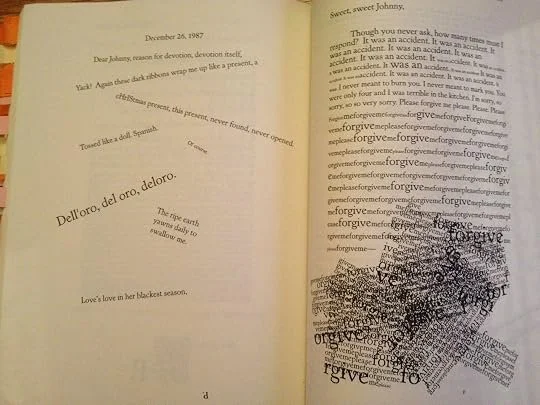
House of Leaves by Mark Z. Danielewski. Source: Goodreads
Mark Z. Danielewski takes the same idea to its extreme in House of Leaves, using multiple fonts for different narrators and warping the page layout itself — text spiraling, boxed, or scattered — to mirror what's happening in the story at that moment.
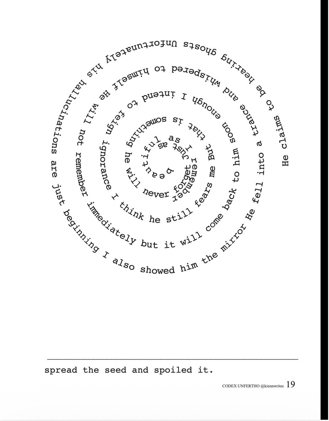
Codex Unfertho by Kienn Nguyen, page 19.
Indie ergodic horror author novel Codex Unfertho by Kienn Nguyen is another interesting example of pushing typographic conventions. Nguyen has created a cult following and continues to push boundaries between stoic literary rules and contemporary storytelling pathways.
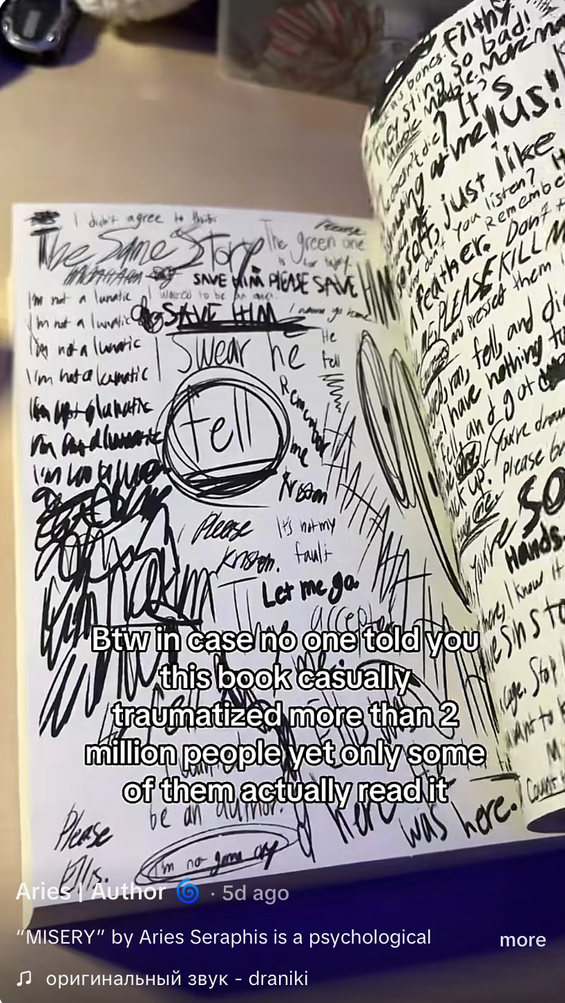
MISERY (Thorns of Vengeance) by Aries Seraphis screenshot of TikTok video about the book. Source: TikTok Aries Seraphis TikTok account
In MISERY (Thorns of Vengeance) by Aries Seraphis, the author uses chaotic layouts to show the character’s descent into madness to critical (TikTok) acclaim and has garnered a cult following for the book. As the book progresses the reader gets an internalised view from the main character that is shown by way of handwritten texts, scribbles and blacked out sections that mirror ink blots.
Build the descent, don't drop it straight away
The most effective examples begin with order. Establish a clean, readable baseline first, so the reader knows what normal looks like. Then introduce small disruptions: a repeated word, an odd margin, a line that doesn't quite fit. Escalate from there.
If the page is chaotic from the first chapter, there's no descent to watch. The reader should feel the change before they can name it, and each shift on the page should follow something that happens to the character. Let the layout respond to events, not simply decorate them.
Keep the reader with you on the journey
Disruption only works while it's still readable. Each departure from convention should have a reason, and the reader should be able to tell what the reason is, even if they can't put it into words. A page that is difficult without purpose reads as a gimmick, and readers put the book down.
Keep some ambiguity alive as well. If the layout makes clear that the character is unwell, the story loses its central question: is this madness, or is something else happening? The best examples leave room for both readings.
Practical considerations before you publish
Check your format
Complex layouts often survive in print but not in reflowable ebooks. If you're planning digital editions, test on multiple devices, or consider a fixed-layout format.Plan for accessibility
Screen readers struggle with text that's scattered, layered or embedded in images. Think about how the effect translates for readers who can't see the page.Tell your editor and proofreader
Intentional errors, odd spacing and broken grammar look identical to real ones. A style sheet that records what's deliberate keeps them from being corrected out of the book.Handle the subject with care
Madness on the page should still feel human. The strongest examples invite empathy, and the disruption serves the character's experience rather than turning it into spectacle.
Writing tip
Write your scene in plain, clean prose first. Then ask what it would look like on the page if the reader could see what the character feels. Change one element, whether the spacing, the font or the line breaks, and see what the scene gains.
A developmental or structural edit is built to find exactly that: the moment the breakdown starts too early, the layout choice that confuses more than it unsettles, the narrator whose unravelling doesn't yet feel earned. Get in touch about our editing services and let's find out what your book needs to go from good to great.